 MapConductor
Info bubble
A bubble anchored to a marker, written in each platform own UI code — a Compose composable, a SwiftUI view, React elements. The SDK only handles positioning and the tail.
01 · How it works
The same shape on all three platforms: hold the selected marker in state and render the bubble only while it is selected. Opening and closing is app state, not SDK state.
Hold the selection
Keep the selected marker (or id) in state — a Set when several bubbles may be open.
Render inside the map
Put Marker and InfoBubble inside the map container and render the bubble only when selected.
Clear on map click
The map onMapClick clears the selection; marker onClick sets it.
02 · Four patterns
The four sample pages under infobubble map one-to-one onto four implementation patterns. Pick a pattern and a platform to see that sample.
Single line
The smallest form: one line of text from marker extra. Border, tail and padding stay at their defaults, so all you write is the content.
var selectedMarker by remember { mutableStateOf<MarkerState?>(null) }
val markerState = remember {
    MarkerState(
        position = GeoPoint.fromLatLong(37.7749, -122.4194),
        icon = DefaultMarkerIcon(fillColor = Color.Blue, label = "SF"),
        extra = "San Francisco - The Golden Gate City",
        onClick = { selectedMarker = it },
    )
}

MapViewContainer(
    modifier = Modifier.fillMaxSize(),
    state = mapViewState,
    onMapClick = { selectedMarker = null },
    onMapLoaded = { selectedMarker = markerState },
) {
    Marker(markerState)

    selectedMarker?.let { marker ->
        InfoBubble(marker = marker) {
            Text(
                text = marker.extra as? String ?: "No information",
                color = MaterialTheme.colorScheme.primary,
                modifier = Modifier.padding(4.dp),
            )
        }
    }
}@State private var selectedMarker: MarkerState? = nil
@StateObject private var markerState = MarkerState(
position: GeoPoint(latitude: 37.7749, longitude: -122.4194),
extra: "San Francisco - The Golden Gate City",
icon: DefaultMarkerIcon(fillColor: UIColor.systemBlue, label: "SF")
)
SampleMapView(
provider: $provider,
/* ... provider states ... */
onMapClick: { _ in selectedMarker = nil }
) {
Marker(state: markerState)
if let marker = selectedMarker {
InfoBubble(marker: marker) {
Text(marker.extra as! String)
.foregroundColor(.accentColor)
.padding(4)
}
}
}
.onAppear {
markerState.onClick = { marker in selectedMarker = marker }
}const [selectedId, setSelectedId] = useState<string | null>('simple-text-bubble');
const marker = useMemo(() => createMarkerState({
id: 'simple-text-bubble',
position: createGeoPoint({ latitude: 37.7749, longitude: -122.4194 }),
icon: new ColorDefaultIcon('#2563eb', { label: 'SF', labelTextColor: '#ffffff' }),
extra: 'San Francisco - The Golden Gate City',
onClick: state => setSelectedId(state.id),
}), []);
return (
<MapViewContainer initialCamera={INIT_CAMERA} onMapClick={() => setSelectedId(null)}>
<Marker state={marker} />
{selectedId === marker.id && (
<InfoBubble marker={marker}>
<div className="bubble-content simple-text-bubble">
{marker.extra as string}
</div>
</InfoBubble>
)}
</MapViewContainer>
);The default tail sits directly above the marker (tailOffset x:0.5 / y:1.0).
Restyled
Change the frame. To adjust colours and radii, Android and React take individual arguments and iOS takes an InfoBubbleStyle. To draw the frame and tail yourself, all three platforms use InfoBubbleCustom — Compose Canvas, SwiftUI Shape, CSS ::before / ::after.
val markerState1 by remember {
    mutableStateOf(
        MarkerState(
            id = "marker1",
            position = GeoPoint.fromLatLong(37.7749, -122.4194),
            icon = DefaultMarkerIcon(
                fillColor = Color.Blue,
                infoAnchor = Offset(0.5f, 0.25f),
                label = "1",
            ),
            draggable = true,
            onClick = onMarkerClick,
        ),
    )
}

selectedMarker?.let { marker ->
    val text = GeoPoint.from(marker.position).toUrlValue(6)
    InfoBubbleCustom(
        marker = marker,
        tailOffset = Offset(0f, 0.5f), // Connected at the middle of the left edge
    ) {
        RightTailInfoBubble(
            bubbleColor = Color.White,
            borderColor = Color.Black,
        ) {
            Text(text = text, color = MaterialTheme.colorScheme.primary)
        }
    }
}@Composable
private fun RightTailInfoBubble(
bubbleColor: Color,
borderColor: Color,
contentPadding: Dp = 8.dp,
cornerRadius: Dp = 4.dp,
tailSize: Dp = 8.dp,
content: @Composable () -> Unit,
) {
Box(modifier = Modifier.wrapContentSize()) {
Canvas(modifier = Modifier.matchParentSize()) {
val path = Path().apply {
// Draw a rounded rectangle and add a triangular tail at the middle of the left edge
lineTo(tail, height / 2 + tail / 2)
lineTo(0f, height / 2)
lineTo(tail, height / 2 - tail / 2)
close()
}
drawPath(path, color = bubbleColor, style = Fill)
drawPath(path, color = borderColor, style = Stroke(width = 2f))
}
Box(modifier = Modifier.padding(start = contentPadding + tailSize)) {
content()
}
}
}private let style = InfoBubbleStyle(
bubbleColor: Color.black.opacity(0.85),
borderColor: Color.white,
contentPadding: 10,
cornerRadius: 10,
tailSize: 10
)
SampleMapView(
provider: $provider,
/* ... provider states ... */
onMapClick: { point in markerState.position = point }
) {
Marker(state: markerState)
InfoBubble(marker: markerState, style: style) {
VStack(alignment: .leading, spacing: 6) {
Text("Night Mode")
.font(.headline)
.foregroundColor(.white)
Text("Custom style bubble")
.font(.subheadline)
.foregroundColor(.white.opacity(0.8))
}
}
// When you draw the whole frame yourself
Marker(state: customMarkerState)
InfoBubbleCustom(
marker: customMarkerState,
tailOffset: CGPoint(x: 0, y: 0.5) // Connected at the middle of the left edge
) {
RightTailInfoBubble(bubbleColor: .white, borderColor: .black) {
Text("Fully custom bubble")
.font(.subheadline)
.foregroundColor(.accentColor)
}
}
}The iOS sample does not draw a right-side tail; it swaps colours, padding and tail size through InfoBubbleStyle, so it looks different from the Android and React samples.
const marker1 = createMarkerState({
  id: 'marker1',
  position: createGeoPoint({ latitude: 37.7749, longitude: -122.4194 }),
  icon: new ColorDefaultIcon('#2563eb', {
    label: '1',
    labelTextColor: '#ffffff',
    infoAnchor: { x: 0.5, y: 0.25 },
  }),
  draggable: true,
  onClick: state => setSelectedId(state.id),
});

const activeMarker = markers.find(m => m.id === selectedId);

<Markers states={markers} />
{activeMarker && (
  <InfoBubbleCustom marker={activeMarker} tailOffset={{ x: 0, y: 0.5 }}>
    <div className="right-tail-info-bubble">
      {activeMarker.position.toUrlValue(6)}
    </div>
  </InfoBubbleCustom>
)}.right-tail-info-bubble {
position: relative;
width: max-content;
max-width: 220px;
padding: 8px;
margin-left: 8px;
border: 2px solid #000;
border-radius: 4px;
background: #fff;
color: #2563eb;
}
/* Use ::before / ::after to lay a left-pointing triangle over it as the tail */The connection point comes from tailOffset (bubble side) and the icon infoAnchor (marker side).
Rich content
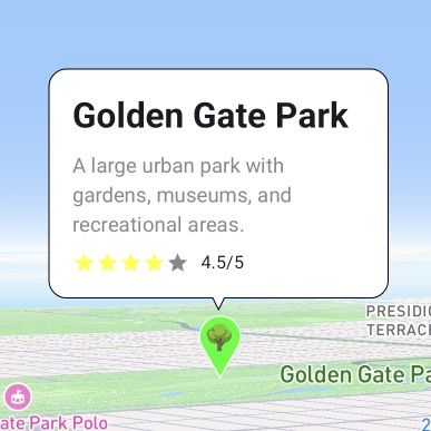
Put an object in extra and embed a full layout — heading, description, rating. Frame styling stays in bubbleColor / borderColor / contentPadding / cornerRadius so your content code only deals with content.
data class LocationInfo(
    val name: String,
    val description: String,
    val rating: Float,
) : Serializable

selectedMarker?.let { marker ->
    val info = marker.extra as? LocationInfo ?: return@let
    InfoBubble(
        marker = marker,
        bubbleColor = if (isDarkTheme) Color.Black else Color.White,
        borderColor = if (isDarkTheme) Color.Gray else Color.Black,
        contentPadding = 16.dp,
        cornerRadius = 12.dp,
    ) {
        Column(modifier = Modifier.width(200.dp)) {
            Text(info.name, style = MaterialTheme.typography.headlineSmall,
                fontWeight = FontWeight.Bold)
            Spacer(Modifier.height(8.dp))
            Text(info.description, style = MaterialTheme.typography.bodyMedium)
            Spacer(Modifier.height(8.dp))
            Row(verticalAlignment = Alignment.CenterVertically) {
                repeat(5) { index ->
                    Icon(Icons.Default.Star, contentDescription = null,
                        tint = if (index < info.rating.toInt()) Color.Yellow else Color.Gray,
                        modifier = Modifier.size(16.dp))
                }
                Text(" ${info.rating}/5", style = MaterialTheme.typography.bodySmall)
            }
        }
    }
}@StateObject private var markerState = MarkerState(
position: GeoPoint(latitude: 37.7694, longitude: -122.4862),
extra: LocationInfo(
name: "Golden Gate Park",
description: "A large urban park with gardens, museums, ...",
rating: 4.5
),
icon: DefaultMarkerIcon(fillColor: UIColor.systemGreen, label: "P")
)
if let marker = selectedMarker,
let info = marker.extra as? LocationInfo {
InfoBubble(marker: marker, style: bubbleStyle()) {
VStack(alignment: .leading, spacing: 8) {
Text(info.name).font(.headline).fontWeight(.bold)
Text(info.description)
.font(.subheadline)
.foregroundColor(.gray)
HStack(spacing: 4) {
ForEach(0..<5, id: \.self) { index in
Image(systemName: "star.fill")
.foregroundColor(index < Int(info.rating) ? .yellow : .gray)
.font(.system(size: 12))
}
Text(String(format: " %.1f/5", info.rating)).font(.caption)
}
}
.frame(width: 200, alignment: .leading)
}
}interface LocationInfo extends Record<string, unknown> {
name: string; description: string; rating: number;
}
const marker = useMemo(() => createMarkerState({
id: 'golden-gate-park',
position: createGeoPoint({ latitude: 37.7694, longitude: -122.4862 }),
icon: new ColorDefaultIcon('#22c55e', { label: '🌳' }),
extra: { name: 'Golden Gate Park', description: '…', rating: 4.5 },
onClick: state => setSelectedId(state.id),
}), []);
const info = marker.extra as LocationInfo;
<InfoBubble
marker={marker}
bubbleColor="#ffffff"
borderColor="#000000"
contentPadding={16}
cornerRadius={12}
>
<div className="rich-location-bubble">
<strong>{info.name}</strong>
<p>{info.description}</p>
<div className="rating-row">…</div>
</div>
</InfoBubble>A large urban park with gardens, museums, and recreational areas.
The Android and iOS samples also swap frame and background colours for dark mode.
Multiple bubbles
Hold the selection as a Set to keep several bubbles open. Render InfoBubble only for open markers, and put a tap handler in the content so the bubble can close itself.
var selectedMarkers by remember { mutableStateOf(setOf<String>()) }

val onMarkerClick: OnMarkerEventHandler = { markerState ->
    selectedMarkers =
        if (selectedMarkers.contains(markerState.id)) {
            selectedMarkers - markerState.id
        } else {
            selectedMarkers + markerState.id
        }
}

MapViewContainer(
    state = mapViewState,
    onMapClick = { selectedMarkers = emptySet() },
) {
    markerStates.forEach { markerState ->
        Marker(markerState)

        if (selectedMarkers.contains(markerState.id)) {
            InfoBubble(
                marker = markerState,
                bubbleColor = Color.White,
                borderColor = Color.Black,
            ) {
                Column(modifier = Modifier.clickable(true, onClick = {
                    selectedMarkers = selectedMarkers - markerState.id
                })) {
                    Text(markerState.extra as String, fontWeight = FontWeight.Bold)
                    Text("Tap to close", color = Color.Gray)
                }
            }
        }
    }
}@State private var selectedMarkers: Set<String> = []
SampleMapView(
provider: $provider,
/* ... provider states ... */
onMapClick: { _ in selectedMarkers = [] }
) {
Marker(state: markerState1)
if selectedMarkers.contains(markerState1.id) {
InfoBubble(marker: markerState1) {
VStack(alignment: .leading, spacing: 4) {
Text(markerState1.extra as? String ?? "Unknown").font(.headline)
Text("Tap to close").font(.subheadline).foregroundColor(.gray)
}
}
}
// markerState2 and markerState3 have the same shape
}
.onAppear {
[markerState1, markerState2, markerState3].forEach { marker in
marker.onClick = { clicked in
if selectedMarkers.contains(clicked.id) {
selectedMarkers.remove(clicked.id)
} else {
selectedMarkers.insert(clicked.id)
}
}
}
}const [selectedIds, setSelectedIds] = useState<Set<string>>(
() => new Set(['marker_0', 'marker_1', 'marker_2'])
);
// Toggle it in onClick
onClick: state => setSelectedIds(prev => {
const next = new Set(prev);
next.has(state.id) ? next.delete(state.id) : next.add(state.id);
return next;
}),
<Markers states={markers} />
{markers.map(marker =>
selectedIds.has(marker.id) ? (
<InfoBubble key={marker.id} marker={marker}
bubbleColor="#ffffff" borderColor="#000000">
<button type="button" className="multi-bubble-content"
onClick={() => close(marker.id)}>
<strong>{marker.extra as string}</strong>
<span>Tap to close</span>
</button>
</InfoBubble>
) : null
)}Map click closes all of them (back to an empty Set) in every sample.
03 · API
InfoBubble draws the framed, tailed bubble for you; InfoBubbleCustom only does the positioning. On iOS the styling arguments are bundled into InfoBubbleStyle.
iOS bundles the styling arguments into this struct and passes it as style.
InfoBubbleStyle(
  bubbleColor: Color,
  borderColor: Color,
  contentPadding: CGFloat,
  cornerRadius: CGFloat,
  tailSize: CGFloat
)
Draw the frame and tail yourself; the SDK only aligns the element.
marker: MarkerState
tailOffset: Offset   // ios: CGPoint
content / children
Anchors a bubble to a coordinate instead of a marker. All three platforms use InfoBubble with a position — the InfoBubble(position:) overload on Compose and iOS.
position: GeoPoint
// react: <InfoBubble position=… />
// compose / ios: InfoBubble(position:)
04 · Notes
No overlap without an icon
A marker with no icon is treated as the default 48px pin anchored at its tip, so the bubble is offset by the real pin size instead of collapsing onto the marker.
Shift with infoAnchor
The connection point on the icon side comes from infoAnchor (an Offset in Compose, x/y in React). The bubble keeps following while the marker is dragged.
Bubble content takes events
Compose clickable, SwiftUI gestures and React onClick all work inside the bubble, independent of the map onMapClick — so the close action can live in the content.