 MapConductor
Markers
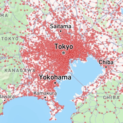
A marker is one state object placed inside the map view. Rendering is handled by the SDK internal engine, which switches technique by count: up to 2,000 markers it uses each map SDK native markers by default and draws raster tiles beyond that — a threshold you can change by passing markerTilingOptions to the map view.
01 · Marker state
MarkerState represents a single marker — position, icon, events and any payload. Assigning to a property applies immediately, and there is no per-provider type.
val marker =
    MarkerState(
        position = GeoPoint.fromLatLong(21.3069, -157.8583),
        icon = DefaultMarkerIcon(fillColor = Color.Red, label = "A"),
        extra = postOffice,
        onClick = { clicked -> viewModel.onMarkerClick(clicked) },
    )

// Assigning to a property is all it takes to redraw
marker.position = nextPointlet marker = MarkerState(
position: GeoPoint.fromLatLong(latitude: 21.3069, longitude: -157.8583),
icon: DefaultMarkerIcon(fillColor: .red, label: "A"),
extra: postOffice,
onClick: { clicked in viewModel.onMarkerClick(clicked) }
)
content.markers = markerStates.map { Marker(state: $0) }const marker = createMarkerState({
id: 'post-office-1',
position: createGeoPoint({ latitude: 21.3069, longitude: -157.8583 }),
icon: new ColorDefaultIcon({ fillColor: '#e74c3c', label: 'A' }),
extra: postOffice,
onClick: setSelected,
});
<Markers states={markerStates} />02 · Icons
From a coloured, labelled default pin to images, canvases and bubble-shaped icons. Every icon looks the same across providers.
03 · The internal rendering engine
Drawing is delegated to the SDK internal rendering engine. While the count is low it uses each map SDK native markers, keeping native hit testing and animation.
Past 2,000 markers the engine changes technique: it renders the markers into tile images and overlays them as a raster layer, removing the per-marker add/update cost in the native SDK. Your code does not change.
Native markers
Raster tiles
// On by default; pass it to the map view to change the threshold
// (the Android parameter is called markerTiling)
val markerTiling =
    MarkerTilingOptions.Default.copy(
        minMarkerCount = 500, // switch to tile rendering from 500 markers
        iconScaleCallback = { _, zoom ->
            if (zoom > 10) 0.8 else if (zoom > 5) 0.5 else 0.2
        },
    )

GoogleMapView(state = mapViewState, markerTiling = markerTiling) { /* markers */ }

// Disable it to keep native markers at any count
val plain = MarkerTilingOptions.Disabledvar content = MapViewContent()
content.markerTilingOptions = MarkerTilingOptions(
minMarkerCount: 500, // switch to tile rendering from 500 markers
iconScaleCallback: { _, zoom in
PostOfficeViewModel.iconScale(zoom: zoom)
}
)
content.markers = markers.map { Marker(state: $0) }const MARKER_TILING_OPTIONS: MarkerTilingOptions = {
...MarkerTilingOptions.Default,
minMarkerCount: 500, // switch to tile rendering from 500 markers
iconScaleCallback: (_state, zoom) => (zoom > 10 ? 0.8 : zoom > 5 ? 0.5 : 0.2),
};
<PostOfficeMapProvider markerTilingOptions={MARKER_TILING_OPTIONS}>
<Markers states={markerStates} />
</PostOfficeMapProvider>04 · Animation
A small set of animations ships with the SDK. Set one at creation or call animate() later; start and end are reported through handlers.
// Set one at creation, or call animate() later
MarkerState(position = point, animation = MarkerAnimation.Bounce)

override fun onMarkerClick(clicked: MarkerState) {
    clicked.animate(clicked.extra as? MarkerAnimation)
}if let animation = clicked.extra as? MarkerAnimation {
clicked.animate(animation)
}const marker = createMarkerState({
id: 'animated-marker',
position: HONOLULU,
animation,
onClick: state => state.animate(MarkerAnimation.Bounce),
});Animating markers are drawn on a dedicated overlay, so they animate even while tile rendering is active. Durations are configurable in the SDK settings.