 MapConductor
सूचना बुलबुला (InfoBubble)
मार्कर से जुड़े बुलबुले को, प्रत्येक प्लेटफ़ॉर्म के UI कोड में जैसा है वैसा ही लिखा जा सकता है। इसके अंदर Compose का Composable, SwiftUI का View, React का तत्व है। स्थिति निर्धारण और पूँछ की रेखाचित्रण केवल SDK द्वारा संभाला जाता है।
01 · तंत्र
3 प्लेटफ़ॉर्म में सामान्य रूप से "चयनित मार्कर को स्थिति के रूप में रखें और चयनित होने के दौरान ही बुलबुला बनाएं" यह संरचना है। बुलबुले को खोलना या बंद करना SDK नहीं, बल्कि ऐप के state द्वारा तय किया जाता है।
चयनित स्थिति रखने वाला
चयनित मार्कर (या ID) को state के रूप में रखता है। यदि एक साथ कई प्रदर्शित करने हों, तो Set का उपयोग करें।
मानचित्र के चाइल्ड के रूप में रखें
Marker और InfoBubble को मानचित्र कंटेनर के चाइल्ड के रूप में साथ रखें, और केवल चयनित होने पर InfoBubble बनाएं।
मानचित्र टैप करने पर बंद करें
मानचित्र के onMapClick पर चयन रद्द करें। मार्कर के onClick चयन सेट करता है।
02 · 4 पैटर्न
नमूना ऐप के infobubble के अंतर्गत 4 पृष्ठ, उनके आधार पर 4 कार्यान्वयन पैटर्न हैं। पैटर्न और प्लेटफ़ॉर्म का चयन करने पर, संबंधित नमूने का कोड प्रदर्शित होता है।
एक पंक्ति पाठ
न्यूनतम संरचना। marker के extra में डाली गई स्ट्रिंग को एक पंक्ति में प्रदर्शित करता है। फ्रेम, पूँछ और मार्जिन डिफ़ॉल्ट मान पर हैं, इसलिए केवल आंतरिक पाठ लिखना है।
var selectedMarker by remember { mutableStateOf<MarkerState?>(null) }
val markerState = remember {
    MarkerState(
        position = GeoPoint.fromLatLong(37.7749, -122.4194),
        icon = DefaultMarkerIcon(fillColor = Color.Blue, label = "SF"),
        extra = "San Francisco - The Golden Gate City",
        onClick = { selectedMarker = it },
    )
}

MapViewContainer(
    modifier = Modifier.fillMaxSize(),
    state = mapViewState,
    onMapClick = { selectedMarker = null },
    onMapLoaded = { selectedMarker = markerState },
) {
    Marker(markerState)

    selectedMarker?.let { marker ->
        InfoBubble(marker = marker) {
            Text(
                text = marker.extra as? String ?: "No information",
                color = MaterialTheme.colorScheme.primary,
                modifier = Modifier.padding(4.dp),
            )
        }
    }
}@State private var selectedMarker: MarkerState? = nil
@StateObject private var markerState = MarkerState(
position: GeoPoint(latitude: 37.7749, longitude: -122.4194),
extra: "San Francisco - The Golden Gate City",
icon: DefaultMarkerIcon(fillColor: UIColor.systemBlue, label: "SF")
)
SampleMapView(
provider: $provider,
/* ... provider states ... */
onMapClick: { _ in selectedMarker = nil }
) {
Marker(state: markerState)
if let marker = selectedMarker {
InfoBubble(marker: marker) {
Text(marker.extra as! String)
.foregroundColor(.accentColor)
.padding(4)
}
}
}
.onAppear {
markerState.onClick = { marker in selectedMarker = marker }
}const [selectedId, setSelectedId] = useState<string | null>('simple-text-bubble');
const marker = useMemo(() => createMarkerState({
id: 'simple-text-bubble',
position: createGeoPoint({ latitude: 37.7749, longitude: -122.4194 }),
icon: new ColorDefaultIcon('#2563eb', { label: 'SF', labelTextColor: '#ffffff' }),
extra: 'San Francisco - The Golden Gate City',
onClick: state => setSelectedId(state.id),
}), []);
return (
<MapViewContainer initialCamera={INIT_CAMERA} onMapClick={() => setSelectedId(null)}>
<Marker state={marker} />
{selectedId === marker.id && (
<InfoBubble marker={marker}>
<div className="bubble-content simple-text-bubble">
{marker.extra as string}
</div>
</InfoBubble>
)}
</MapViewContainer>
);डिफ़ॉल्ट पूँछ मार्कर के ठीक ऊपर बैठती है (tailOffset x:0.5 / y:1.0)।
शैली परिवर्तन
फ्रेम की शैली बदलने का पैटर्न। यदि केवल रंग या कोनों को गोल करना है, तो Android और React के लिए अलग-अलग तर्क, iOS के लिए InfoBubbleStyle उपयोग करें। यदि फ्रेम और पूँछ दोनों को स्वयं बनाना है, तो तीनों प्लेटफ़ॉर्म पर InfoBubbleCustom का उपयोग करें (Compose के लिए Canvas, SwiftUI के लिए Shape, React के लिए CSS का ::before / ::after)।
val markerState1 by remember {
    mutableStateOf(
        MarkerState(
            id = "marker1",
            position = GeoPoint.fromLatLong(37.7749, -122.4194),
            icon = DefaultMarkerIcon(
                fillColor = Color.Blue,
                infoAnchor = Offset(0.5f, 0.25f),
                label = "1",
            ),
            draggable = true,
            onClick = onMarkerClick,
        ),
    )
}

selectedMarker?.let { marker ->
    val text = GeoPoint.from(marker.position).toUrlValue(6)
    InfoBubbleCustom(
        marker = marker,
        tailOffset = Offset(0f, 0.5f), // बाएँ किनारे के बीच में जुड़ता है
    ) {
        RightTailInfoBubble(
            bubbleColor = Color.White,
            borderColor = Color.Black,
        ) {
            Text(text = text, color = MaterialTheme.colorScheme.primary)
        }
    }
}@Composable
private fun RightTailInfoBubble(
bubbleColor: Color,
borderColor: Color,
contentPadding: Dp = 8.dp,
cornerRadius: Dp = 4.dp,
tailSize: Dp = 8.dp,
content: @Composable () -> Unit,
) {
Box(modifier = Modifier.wrapContentSize()) {
Canvas(modifier = Modifier.matchParentSize()) {
val path = Path().apply {
// गोल कोनों वाला आयत खींचें और बाएँ किनारे के बीच में त्रिकोणीय पूँछ जोड़ें
lineTo(tail, height / 2 + tail / 2)
lineTo(0f, height / 2)
lineTo(tail, height / 2 - tail / 2)
close()
}
drawPath(path, color = bubbleColor, style = Fill)
drawPath(path, color = borderColor, style = Stroke(width = 2f))
}
Box(modifier = Modifier.padding(start = contentPadding + tailSize)) {
content()
}
}
}private let style = InfoBubbleStyle(
bubbleColor: Color.black.opacity(0.85),
borderColor: Color.white,
contentPadding: 10,
cornerRadius: 10,
tailSize: 10
)
SampleMapView(
provider: $provider,
/* ... provider states ... */
onMapClick: { point in markerState.position = point }
) {
Marker(state: markerState)
InfoBubble(marker: markerState, style: style) {
VStack(alignment: .leading, spacing: 6) {
Text("Night Mode")
.font(.headline)
.foregroundColor(.white)
Text("Custom style bubble")
.font(.subheadline)
.foregroundColor(.white.opacity(0.8))
}
}
// जब पूरा फ़्रेम खुद खींचना हो
Marker(state: customMarkerState)
InfoBubbleCustom(
marker: customMarkerState,
tailOffset: CGPoint(x: 0, y: 0.5) // बाएँ किनारे के बीच में जुड़ता है
) {
RightTailInfoBubble(bubbleColor: .white, borderColor: .black) {
Text("Fully custom bubble")
.font(.subheadline)
.foregroundColor(.accentColor)
}
}
}iOS का नमूना दाईं ओर की पूँछ को स्वयं बनाने के बजाय, InfoBubbleStyle का उपयोग करके रंग, मार्जिन और पूँछ आकार को बदलने का दृष्टिकोण है। Android / React संस्करण से दिखावट अलग है।
const marker1 = createMarkerState({
  id: 'marker1',
  position: createGeoPoint({ latitude: 37.7749, longitude: -122.4194 }),
  icon: new ColorDefaultIcon('#2563eb', {
    label: '1',
    labelTextColor: '#ffffff',
    infoAnchor: { x: 0.5, y: 0.25 },
  }),
  draggable: true,
  onClick: state => setSelectedId(state.id),
});

const activeMarker = markers.find(m => m.id === selectedId);

<Markers states={markers} />
{activeMarker && (
  <InfoBubbleCustom marker={activeMarker} tailOffset={{ x: 0, y: 0.5 }}>
    <div className="right-tail-info-bubble">
      {activeMarker.position.toUrlValue(6)}
    </div>
  </InfoBubbleCustom>
)}.right-tail-info-bubble {
position: relative;
width: max-content;
max-width: 220px;
padding: 8px;
margin-left: 8px;
border: 2px solid #000;
border-radius: 4px;
background: #fff;
color: #2563eb;
}
/* ::before / ::after से बाईं ओर मुड़ा त्रिकोण ऊपर रखकर पूँछ बनाएँ */जुड़ाव का बिंदु tailOffset (बबल की ओर) और आइकन के infoAnchor (मार्कर की ओर) से तय होता है।
समृद्ध सामग्री
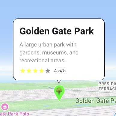
extra में एक ऑब्जेक्ट डालें, और शीर्षक, विवरण और मूल्यांकन सहित लेआउट को एम्बेड करें। फ्रेम bubbleColor / borderColor / contentPadding / cornerRadius से समायोजित किया जा सकता है, और आंतरिक कोड केवल सामग्री के लेआउट पर केंद्रित हो सकता है।
data class LocationInfo(
    val name: String,
    val description: String,
    val rating: Float,
) : Serializable

selectedMarker?.let { marker ->
    val info = marker.extra as? LocationInfo ?: return@let
    InfoBubble(
        marker = marker,
        bubbleColor = if (isDarkTheme) Color.Black else Color.White,
        borderColor = if (isDarkTheme) Color.Gray else Color.Black,
        contentPadding = 16.dp,
        cornerRadius = 12.dp,
    ) {
        Column(modifier = Modifier.width(200.dp)) {
            Text(info.name, style = MaterialTheme.typography.headlineSmall,
                fontWeight = FontWeight.Bold)
            Spacer(Modifier.height(8.dp))
            Text(info.description, style = MaterialTheme.typography.bodyMedium)
            Spacer(Modifier.height(8.dp))
            Row(verticalAlignment = Alignment.CenterVertically) {
                repeat(5) { index ->
                    Icon(Icons.Default.Star, contentDescription = null,
                        tint = if (index < info.rating.toInt()) Color.Yellow else Color.Gray,
                        modifier = Modifier.size(16.dp))
                }
                Text(" ${info.rating}/5", style = MaterialTheme.typography.bodySmall)
            }
        }
    }
}@StateObject private var markerState = MarkerState(
position: GeoPoint(latitude: 37.7694, longitude: -122.4862),
extra: LocationInfo(
name: "Golden Gate Park",
description: "A large urban park with gardens, museums, ...",
rating: 4.5
),
icon: DefaultMarkerIcon(fillColor: UIColor.systemGreen, label: "P")
)
if let marker = selectedMarker,
let info = marker.extra as? LocationInfo {
InfoBubble(marker: marker, style: bubbleStyle()) {
VStack(alignment: .leading, spacing: 8) {
Text(info.name).font(.headline).fontWeight(.bold)
Text(info.description)
.font(.subheadline)
.foregroundColor(.gray)
HStack(spacing: 4) {
ForEach(0..<5, id: \.self) { index in
Image(systemName: "star.fill")
.foregroundColor(index < Int(info.rating) ? .yellow : .gray)
.font(.system(size: 12))
}
Text(String(format: " %.1f/5", info.rating)).font(.caption)
}
}
.frame(width: 200, alignment: .leading)
}
}interface LocationInfo extends Record<string, unknown> {
name: string; description: string; rating: number;
}
const marker = useMemo(() => createMarkerState({
id: 'golden-gate-park',
position: createGeoPoint({ latitude: 37.7694, longitude: -122.4862 }),
icon: new ColorDefaultIcon('#22c55e', { label: '🌳' }),
extra: { name: 'Golden Gate Park', description: '…', rating: 4.5 },
onClick: state => setSelectedId(state.id),
}), []);
const info = marker.extra as LocationInfo;
<InfoBubble
marker={marker}
bubbleColor="#ffffff"
borderColor="#000000"
contentPadding={16}
cornerRadius={12}
>
<div className="rich-location-bubble">
<strong>{info.name}</strong>
<p>{info.description}</p>
<div className="rating-row">…</div>
</div>
</InfoBubble>A large urban park with gardens, museums, and recreational areas.
Android और iOS के सैंपल डार्क मोड के लिए फ़्रेम और बैकग्राउंड के रंग भी बदल देते हैं।
एक साथ कई प्रदर्शन
चयन को Set में रखने पर, आप कई बबल्स को एक साथ खुला रख सकते हैं। केवल खुले मार्करों के लिए InfoBubble बनाएं और अंदर टैप इंटरैक्शन जोड़ें ताकि बबल स्वयं बंद हो सके।
var selectedMarkers by remember { mutableStateOf(setOf<String>()) }

val onMarkerClick: OnMarkerEventHandler = { markerState ->
    selectedMarkers =
        if (selectedMarkers.contains(markerState.id)) {
            selectedMarkers - markerState.id
        } else {
            selectedMarkers + markerState.id
        }
}

MapViewContainer(
    state = mapViewState,
    onMapClick = { selectedMarkers = emptySet() },
) {
    markerStates.forEach { markerState ->
        Marker(markerState)

        if (selectedMarkers.contains(markerState.id)) {
            InfoBubble(
                marker = markerState,
                bubbleColor = Color.White,
                borderColor = Color.Black,
            ) {
                Column(modifier = Modifier.clickable(true, onClick = {
                    selectedMarkers = selectedMarkers - markerState.id
                })) {
                    Text(markerState.extra as String, fontWeight = FontWeight.Bold)
                    Text("Tap to close", color = Color.Gray)
                }
            }
        }
    }
}@State private var selectedMarkers: Set<String> = []
SampleMapView(
provider: $provider,
/* ... provider states ... */
onMapClick: { _ in selectedMarkers = [] }
) {
Marker(state: markerState1)
if selectedMarkers.contains(markerState1.id) {
InfoBubble(marker: markerState1) {
VStack(alignment: .leading, spacing: 4) {
Text(markerState1.extra as? String ?? "Unknown").font(.headline)
Text("Tap to close").font(.subheadline).foregroundColor(.gray)
}
}
}
// markerState2 और markerState3 का ढाँचा भी वही है
}
.onAppear {
[markerState1, markerState2, markerState3].forEach { marker in
marker.onClick = { clicked in
if selectedMarkers.contains(clicked.id) {
selectedMarkers.remove(clicked.id)
} else {
selectedMarkers.insert(clicked.id)
}
}
}
}const [selectedIds, setSelectedIds] = useState<Set<string>>(
() => new Set(['marker_0', 'marker_1', 'marker_2'])
);
// onClick में टॉगल करें
onClick: state => setSelectedIds(prev => {
const next = new Set(prev);
next.has(state.id) ? next.delete(state.id) : next.add(state.id);
return next;
}),
<Markers states={markers} />
{markers.map(marker =>
selectedIds.has(marker.id) ? (
<InfoBubble key={marker.id} marker={marker}
bubbleColor="#ffffff" borderColor="#000000">
<button type="button" className="multi-bubble-content"
onClick={() => close(marker.id)}>
<strong>{marker.extra as string}</strong>
<span>Tap to close</span>
</button>
</InfoBubble>
) : null
)}हर सैंपल में मैप पर क्लिक करने से ये सब बंद हो जाते हैं (वापस खाली Set)।
03 · API
InfoBubble एक पूंछ के साथ फ्रेम बनाने वाला एक उच्च-स्तरीय घटक है, जबकि InfoBubbleCustom केवल संरेखण करने वाला एक निम्न-स्तरीय घटक है। iOS स्टाइल तर्कों को InfoBubbleStyle में एकत्रित करके पास करता है।
iOS अलग-अलग तर्कों के बजाय इस संरचना को style में एक साथ पास करता है।
InfoBubbleStyle(
  bubbleColor: Color,
  borderColor: Color,
  contentPadding: CGFloat,
  cornerRadius: CGFloat,
  tailSize: CGFloat
)
फ्रेम और पूंछ दोनों स्वयं बनाने का पैटर्न। SDK केवल स्थिति संरेखण के लिए जिम्मेदार है।
marker: MarkerState
tailOffset: Offset   // ios: CGPoint
content / children
मार्कर के बजाय निर्देशांक पर सीधे बबल दिखाता है। तीनों प्लेटफ़ॉर्म में InfoBubble को position पास करने का तरीका (Compose और iOS में InfoBubble(position:) ओवरलोड) एकसमान है।
position: GeoPoint
// react: <InfoBubble position=… />
// compose / ios: InfoBubble(position:)
04 · ध्यान दें
आइकन निर्दिष्ट न होने पर भी ओवरलैप नहीं होता
बिना icon पास किए गए मार्कर को डिफ़ॉल्ट पिन (48px, निचला किनारा आधार) के रूप में माना जाता है, और बबल उसके वास्तविक आकार के अनुसार विस्थापित होता है। मार्कर के साथ ओवरलैप नहीं होगा।
infoAnchor से विस्थापित करें
आइकन पक्ष का कनेक्शन पॉइंट infoAnchor (Compose में Offset, React में x/y) से बदला जा सकता है। ड्रैग के दौरान भी बबल अनुसरण करता है।
बबल की सामग्री ईवेंट प्राप्त कर सकती है
Compose का clickable, SwiftUI के जेस्चर, और React के onClick को यथावत रखा जा सकता है। मानचित्र के onMapClick से स्वतंत्र रूप से चलता है, इसलिए बंद करने की कार्यवाही सामग्री पर रखी जा सकती है।